I thought it would be interesting to study the covers of the debut literary titles this year. I’ll give a shout to the three African writers on this list, Helen Oyeyemi, Teju Cole, who both are of Nigerian Descent, and Dinaw Minegetsu, who’s of Ethiopian descent. And surprise, surprise Larry McMurty, yep that one who wrote Lonesome Dove, is releasing something this year. I had had the impression that he was old and dead already.
Best Cover? The Man who Walked Away. The telescopic arrangement draws your eye.
Terrible looking Covers in my humble opinion:
Harlequin’s Million’s. Oh look my twelve-year-old wrote a book.
The Corpse Exhibition and other stories. Might good on hardback, but looks boring on an ebook cover.
One more thing. The cover artist must have been on vacation that week.
Can’t and Won’t. Forget the cover artist. I can haz type.
Faces in the Crowd. Adding a posted note doesn’t make the non descript picture of a subway interior more interesting.
Pushkin Hills. What could be more exciting than an empty chair and table in the middle of a field? And the icky orange for the font?
Nine rabbits. The cover artist was on pot that week.
An Unnecessary Woman. Looks like an ad for a used book.
Which covers do you like best? Which covers do you like the least?
Don’t forget to click on the covers to see the book descriptions on Amazon.


Don’t forget to click on the covers to see the book descriptions on Amazon.

I have to say: I think “Inappropriate Behaviour” by Murrary Farish is the poorest of them all cover-wise. The grass looks rather uninteresting; it doesn’t grab your attention from up close, never mind at thumbnail. It also conflicts with the message given by the shadow: is this a mystery, or a book on ecology?
I don’t think the generic sans-serif does it any favours either.
The “Sun and Other Stars” looks a bit gaudy in my eyes as well–I don’t like the whole city landscape thing; it’s too literal, and produces typographic noise.
For my best-liked cover, “In Paradise” would probably come out top in terms of sheer atmosphere; the light blue background, the snow flakes, the lone, dark railroad: all serve to give it a real sense of mystery. The typography is apt as well.
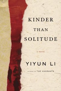
But really, I think my favourite would have to be “Kinder than Solitude”. The colours are attractive, easily visible, and appealing; I really like the abstract, artistic feel of it too. (Much better than those atrocious romance covers I keep seeing.) The sans-serif works surprisingly well–though the serif font is a bit plain and the cover could do with a bit more typographic flavour.
Anyway, sorry for the essay. I like covers.
I agree that the ‘Inappropriate Behvariour’ cover is very plain and not very eye-catching but I think the shadow being front and center gives me a hit to the book’s dark theme. I do like the font on the ‘Sun and Other Stars’; Gaudy might very well be the intended effect. I have read ‘Kinder than Solitude,’ the cover does capture the mood: quiet and contemplative.
Thanks for your comment. How are you doing? I haven’t heard from you in a while. I hope you’re well.
Been busy what with publishing my short story (check it out–“The Sandman”) and revising for my exams…
I probably shouldn’t be publishing anything right now, but I was bored senseless of waiting (and getting more apologetic rejections from agents on that novel of mine).